Embed Responsive iFrame in Elementor | Easy Way
Key Takeaways
What’s the best way to add a responsive iFrame in Elementor?
The best way to embed a responsive iFrame in Elementor is with the Custom iFrame plugin by Coderz Studio. It gives you controls for height, padding, and content width with breakpoints for desktop, tablet, and mobile. These settings make the iFrame responsive and easy to adjust. The plugin works fast and lets you customize everything without coding.
First, let’s look at the different ways to embed an iFrame in Elementor. After that, we’ll see how to make it responsive.
How to embed iFrame in Elementor?
You can embed an iFrame in Elementor in two ways: with a plugin or with the HTML widget.
1. Using a plugin
The easiest method is with a plugin. There are many available, but the Custom iFrame for Elementor plugin by Coderz Studio is the most beginner-friendly. It makes the iFrame responsive and gives you extra options to control the look. You don’t need coding knowledge, just add the widget and paste your link.
2. Using the HTML widget
The second option is the Elementor HTML widget. This method works with copy-paste code, but you need a little understanding of HTML. It has fewer options and no built-in settings, so you may have to style the container with custom CSS.
For most users, the plugin is the better choice. It’s faster, easier, and have options to make the iFrame responsive. Let’s see how to embed a responsive iFrame in Elementor using the plugin.
How to Embed Responsive iframe in Elementor Using the Plugin?
The easiest way to add a responsive iFrame in Elementor is with the Custom iFrame plugin by Coderz Studio. Here’s how to do it step by step:
- Install and activate the Custom iFrame plugin in WordPress.
- Edit the page with Elementor where you want to add the iFrame.
- Drag and drop the Custom iFrame widget into the editor.
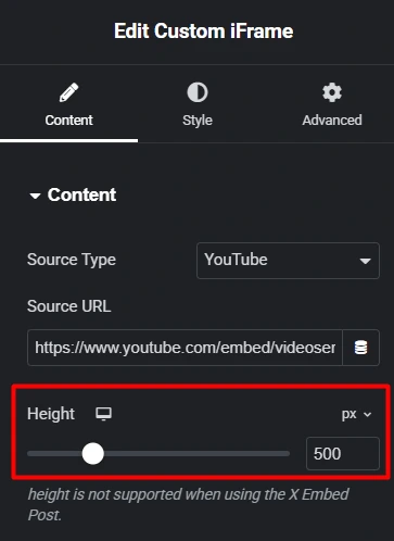
- Paste your content link into the Source URL field.
- Set the height for your iFrame. The option has three breakpoints: desktop, tablet, and mobile. You can set custom heights for each device viewport so your content always fits well.
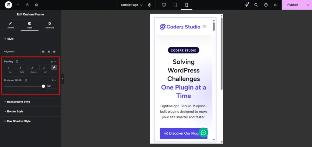
- Open the Style menu to adjust padding and content width with same three breakpoints. Use them to fine-tune the layout and make your iFrame fully responsive.
These settings work with px, em, or % units and let you fine-tune the design. This makes your iFrame fully responsive without extra code.
With this plugin, you can embed more than just websites. It supports videos, audio, PDFs, and other external content with a simple URL.
The Custom iFrame plugin also comes with more settings for customization, performance, and SEO. It’s a complete solution for embedding responsive iFrames in Elementor.
Why Choose the Custom iFrame Plugin for Responsive Embeds?
The Custom iFrame plugin by Coderz Studio is more than a basic embed tool. It supports over 100 content sources, including websites, videos, audio, PDFs, maps, and more. This means you can embed almost anything with just a link.
What options does Custom iFrame give for design and performance?
The Custom iFrame free version comes with smart features like a scrollbar toggle, lazy load for faster performance, and a custom ID field for adding your own CSS or JavaScript. For design, you can adjust alignment, background, borders, and even box shadows, all directly in Elementor.
If you upgrade to Custom iFrame Pro, you unlock advanced options. These include:
- Custom iFrame attributes for extra flexibility.
- Advanced security settings to keep embeds safe.
- Special embed options for platforms like YouTube, Vimeo, PDFs, and even X (formerly Twitter).
- Priority helpdesk support for quick assistance.
Is it worth using this Custom iFrame plugin?
Yes. The Custom iFrame plugin is a complete solution for embedding responsive content in Elementor. Beginners can use it with ease, while advanced users get pro-level customization and control.
Now, let’s go through some FAQs to clear things up.
FAQ: Responsive iFrame in Elementor
Conclusion
There are two ways to add a responsive iFrame in Elementor. You can use the HTML widget or a plugin. The HTML widget works but needs manual adjustments and coding.
With the Custom iFrame plugin, you can embed any content: videos, maps, or external pages and make it look perfect on all devices. The plugin gives you control over width, height, and padding, and lets you adjust settings for desktop, tablet, and mobile.
Try it out and see the difference yourself. Have questions or tips? Drop a comment below and join the conversation.
3 Comments